Warm Tablescape Ideas Made Easy: 5-in-1 Digital Bundle
Smart Styling System for Warm Tablescape Ideas – 5-in-1 Digital Bundle
A warm tablescape feels layered, welcoming, and intentional—without looking fussy. The Smart Styling System for Warm Tablescape Ideas – 5-in-1 Digital Bundle is built to make that look repeatable: choose a color story, balance heights, mix textures, then finish with the small details that make guests want to linger. It’s designed for quick planning before a dinner party and for saving favorite combinations so you can reuse them across seasons with minimal extra shopping.
What “warm” means in a tablescape
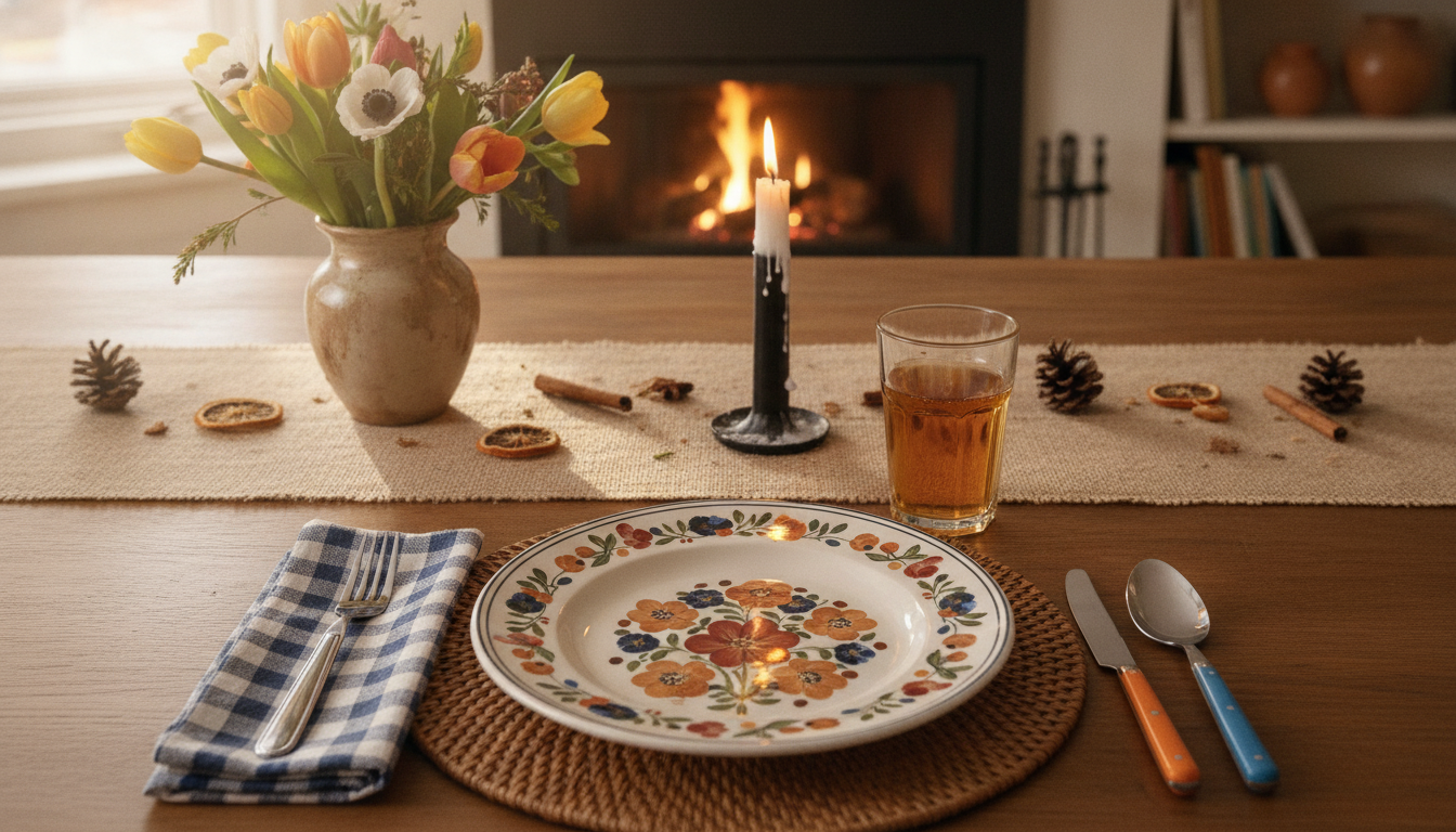
Warmth in a tablescape is less about “dark” and more about a cozy color temperature plus materials that feel tactile. Think amber, rust, terracotta, blush, honey, and warm white—tones that look especially flattering in candlelight. Pair them with textures that read natural and touchable, like linen, wood, stoneware, and warm metals such as brass.
The goal is a cohesive glow: softened contrasts, candlelight-friendly hues, and a few darker accents to keep everything grounded. Warm doesn’t require heavy color saturation—light neutrals can still read warm when they lean creamy instead of stark, and when they’re paired with organic textures and aged metallics.
Lighting matters more than most people realize. If you’re using bulbs, choosing pleasant, accurate light helps all those warm tones look rich rather than muddy. The U.S. Department of Energy explains how lighting quality is influenced by measures like color rendering, which affects how colors appear under artificial light (Color Rendering Index (CRI) and lighting quality).
What’s inside the 5-in-1 digital bundle
This bundle works like a guided system for building a tablescape from the center outward: base layer, dinnerware, focal elements, lighting, and finishing touches. It includes done-for-you warm palettes and pairing suggestions to reduce decision fatigue when you’re mixing florals, linens, and tableware. Prompted checklists and templates help keep the look consistent across different table sizes and occasions, while a planning method shows how to create multiple “fresh” looks using the same core pieces by swapping only a few accents.
Bundle elements and how they’re used
| Bundle element | What it helps decide | Best time to use it |
|---|---|---|
| Palette guidance | Color mix for linens, flowers, candles, and accents | Before shopping or pulling items from storage |
| Layering framework | Placemat/runner/linen combinations and spacing | When setting the base of the table |
| Height and focal map | Where to place tall vs. low items for conversation-friendly sightlines | Before placing florals and candles |
| Texture pairing prompts | How to balance matte, glossy, woven, and metallic finishes | When selecting dishware and decor |
| Finishing checklist | Small touches: name cards, napkin styling, seasonal accents | Last 10 minutes before guests arrive |
The warm tablescape “formula” the system reinforces
A warm table looks effortless when the decisions follow a simple pattern. Start with one anchor color and two supporting neutrals, then add one metallic or dark accent for depth (for example: terracotta + cream + sand + aged brass). This keeps the palette focused while still feeling layered.
Next, repeat the same tone at least three times across the table—like napkins, candle holders, and florals—so the styling feels intentional rather than accidental. For the centerpiece line, aim for “islands” (small clusters) instead of one continuous arrangement, which keeps place settings usable and makes serving easier.
Finally, mix heights while protecting sightlines. Keep most elements at or below glass height. If you want something tall, use airy stems or place taller pieces toward the ends so conversation stays comfortable.
Warm palettes that work year-round
If you want warm tablescape ideas you can reuse without constantly buying new decor, start with palettes that flex across seasons:
- Amber + cream + walnut: Great for everyday dinners and fall hosting; add greenery for freshness.
- Blush + sand + warm white: Soft, romantic warmth; pairs well with clear glass and ivory candles.
- Rust + clay + charcoal: Richer, modern warmth; keep dinnerware simple and lean into matte textures.
- Honey + olive + natural linen: Warm, organic, relaxed—ideal for brunch, outdoor meals, and casual gatherings.
How to style quickly when time is tight
One practical note for hosts: make sure decor doesn’t interfere with serving and food safety. The USDA’s serving guidance is a helpful refresher for keeping hot foods hot and cold foods cold while guests linger at the table (Food safety: keep hot food hot and cold food cold).
Making the most of a digital styling system
Recommended picks to support your hosting routine
- Smart Styling System for Warm Tablescape Ideas – 5-in-1 Digital Bundle (digital): the step-by-step framework for palettes, layering, heights, textures, and finishing touches.
- Mini Chain Shoulder Bag: a small, polished option for hosts who like to keep essentials handy while greeting guests and moving between kitchen and table.
- How AI Can Help You Organize Your Makeup Collection | Smart Beauty Decluttering Ebook (digital): a practical add-on if you enjoy systems and checklists—especially helpful for streamlining “getting ready” before hosting.
Who this bundle suits
FAQ
What makes a tablescape look warm without turning too dark?
Use warm whites and creamy neutrals as your base, then add one or two deeper warm tones (like rust, walnut, or amber) plus a soft metallic such as brass. Keep negative space on the table so the palette can breathe, and rely on candlelight for glow rather than adding more dark objects.
How many candles and florals are enough for a medium table?
Aim for about 3–7 elements across the centerline (for example, 3 bud vases + 3 candles). Keep most pieces low, and if you add height, use airy stems and place taller items toward the ends to protect sightlines.
Can the same warm tablescape work for both everyday meals and special occasions?
Yes—keep the base layers consistent (neutral plates, runner or placemats, simple glassware) and change only the finishing touches. Swapping napkin styling, a seasonal sprig, candle color, or one statement centerpiece can shift the table from casual to celebration-ready.










Leave a comment